Required choices lead
The next choice stays visible. Secondary details open when customers need them.

Redesign project · 2025
Redesigning Sendmoments’ product options so customers can understand the total and start personalizing with confidence.
My UX/UI work covered desktop and mobile, focusing on product-option hierarchy, consistent controls, and the step into personalization.
Format and paper used edit icons, optional extras used checkboxes, and quantity used another selector. The price sat above the choices while the action sat below. The interface asked customers to interpret the controls as well as the product.
I audited the live experience and competitor patterns, then grouped choices into consistent controls with a stable price and action area.
The early direction already brought the total beside the actions and gave payment and delivery their own space. The approved design refined the option rows and the relationship between ordering a sample and starting a design.
The priority was a clearer decision sequence—not removing the choices that make the product personal.
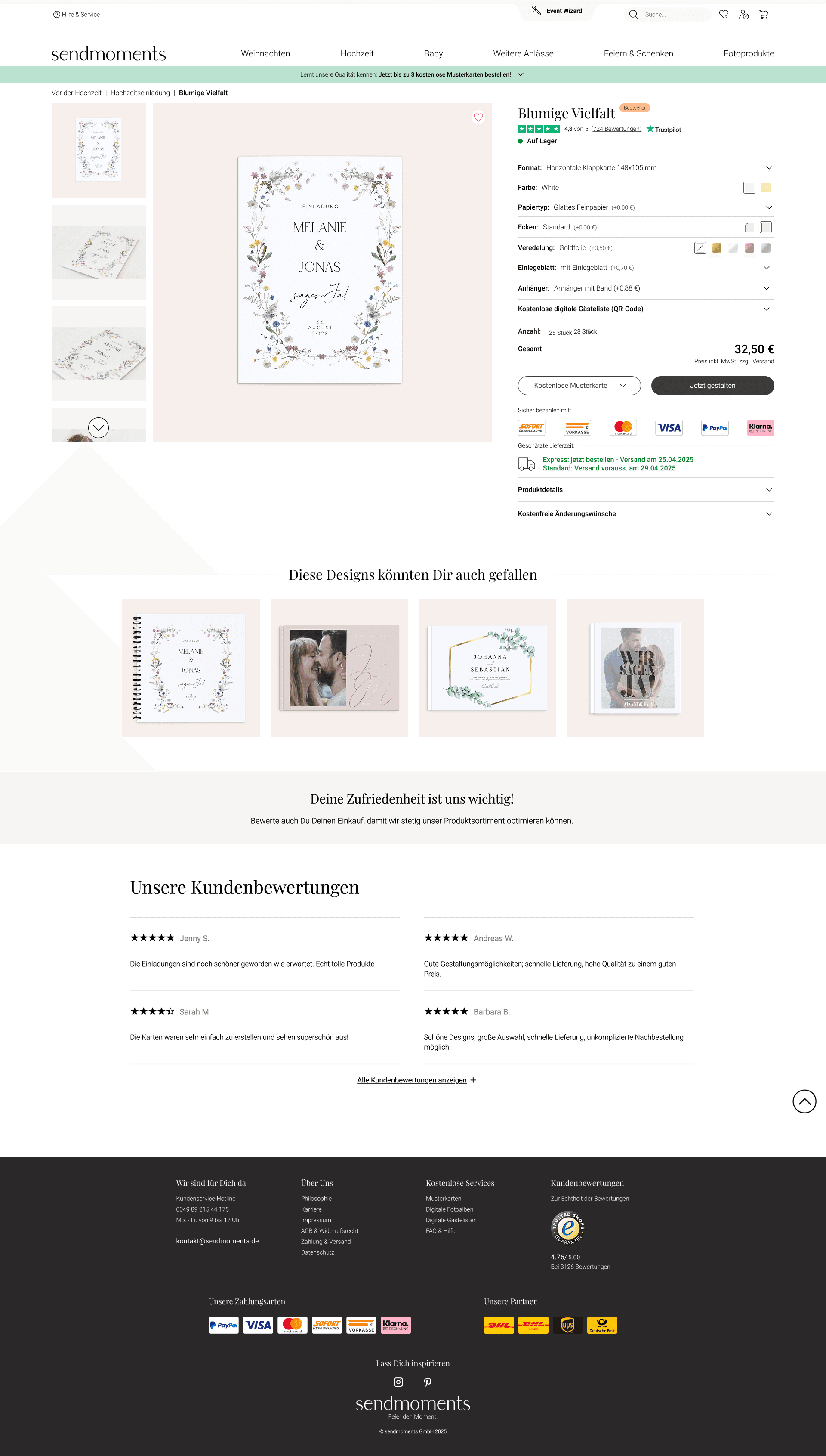
Approved interface · Implemented in production
Pencils, swatches, and selectors ask for different interactions.
Repeatable controlsOptional extras sit in the same sequence as product choices.
Required choices firstThe price sits above the options, apart from the primary action.
Price beside the action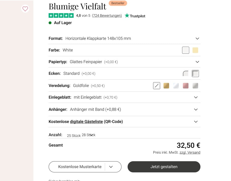
Dropdown rows group format and paper choices. Visible swatches remain where a visual comparison helps. Each control communicates the kind of choice it contains.
Desktop keeps the product and its options side by side. Mobile brings the choices into a focused, touch-friendly flow while preserving the same configuration, total, and route into the editor.
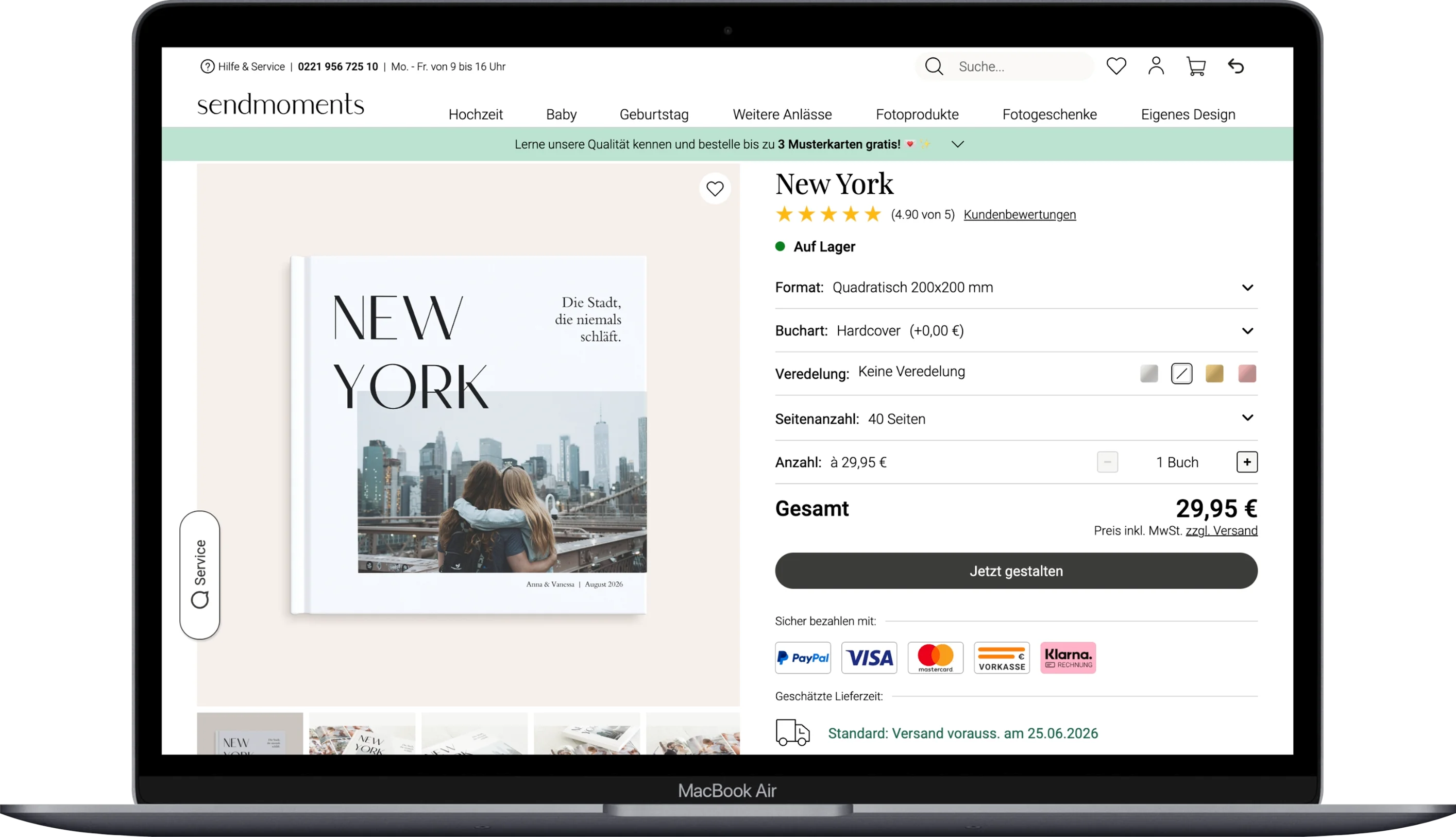
Production behavior shown on a photobook to demonstrate the same decision model across products.
The redesign moved from design exploration into production across desktop and mobile. Its delivered value is a consistent way to configure a product, review the total, and begin personalizing.
The next choice stays visible. Secondary details open when customers need them.
Price, delivery, and reassurance sit beside the primary action.
The same control model carries from desktop to mobile and across product categories.
Post-launch conversion and revenue figures are not available for this case study. The next step is to compare configuration completion, time to a valid selection, and entry into the editor across desktop and mobile. That would test whether the clearer hierarchy also reduces hesitation.