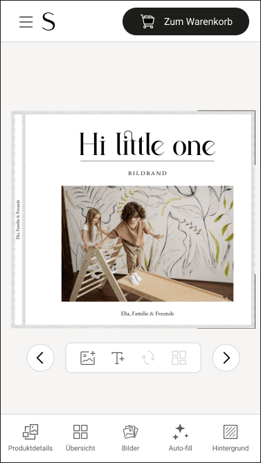
Photobooks
Build a story with photos, page layouts, and backgrounds.

For the Sendmoments Configurator, I designed the UX and interface for personalizing cards, photobooks, photo boxes, and newspapers. The ambition: full creative freedom on every product, with mobile as a complete workspace—not just a preview of the desktop experience.
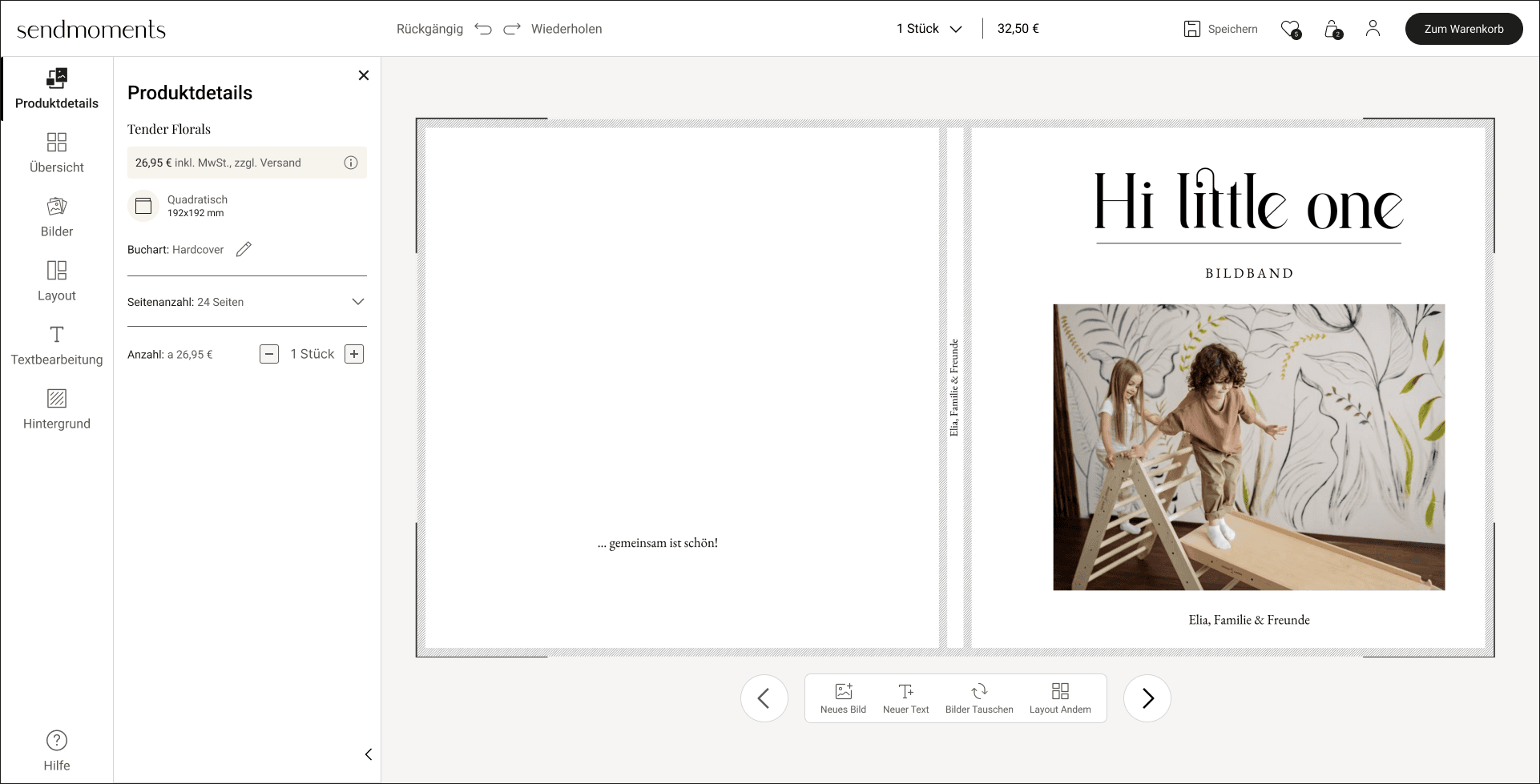
The challenge was to make room for both the creation and its controls. Shrinking a desktop sidebar would leave neither usable. My approach separates the canvas from focused editing views: keep the product central, then give each decision the space it needs.
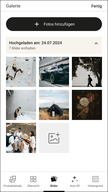
A dedicated gallery keeps uploading and choosing photos separate from arranging them. A clear upload action, familiar thumbnails, and grouped images give this first decision room to breathe.
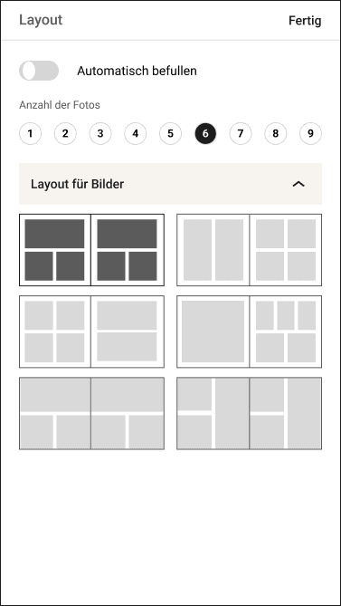
Photo-count choices and visual previews bring composition controls to mobile. Automatic filling offers a starting point, while manual layouts keep the customer in control.
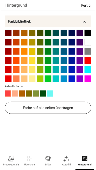
The background panel gives color its own focused view. Keep a choice local or apply it across all pages, balancing personal expression with consistency.
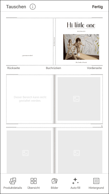
The swapping view brings covers, spreads, and image areas together. Showing non-editable areas alongside them keeps the boundaries of personalization visible, even on a phone.
A card and a photobook need different controls, not a different editor. I kept the canvas, contextual tools, and bottom navigation familiar, adapting the options to each product.
Build a story with photos, page layouts, and backgrounds.
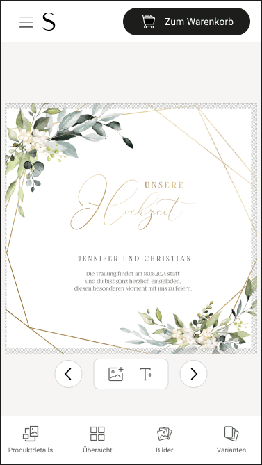
Make a chosen design personal with your own words and images.
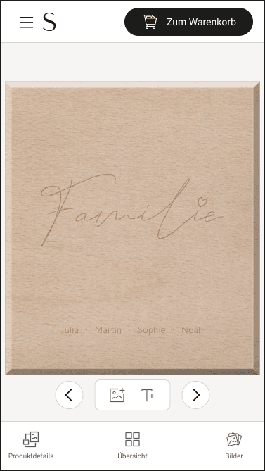
Personalize the keepsake, as well as the memories inside.
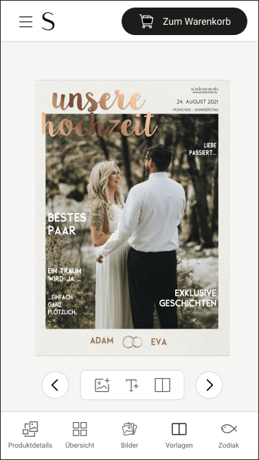
Bring photos and stories together across a different format.
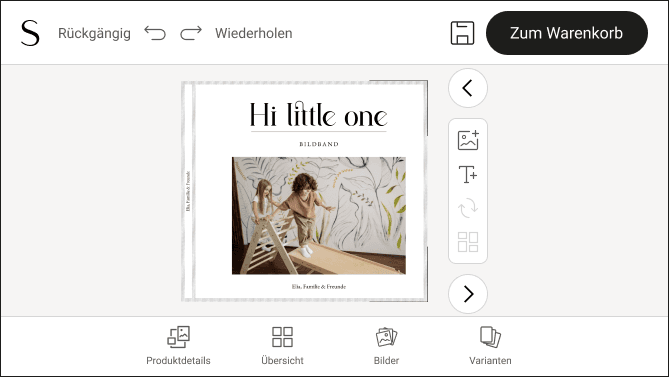
Mobile isn’t one fixed canvas. I also designed a landscape workspace, moving contextual tools to the side and retaining navigation along the bottom. The layout uses the wider view without requiring the customer to move to a computer.
On desktop, the canvas and editing panel can sit together. Selecting content brings its controls into context, so the customer can relate an edit to the result. This existing interaction demo shows the invitation editor in motion, including changes to the wording on the card.
The design brings a common editing language to four product families and gives mobile its own considered workspace. The key decision was not to expose every control at once, but to keep meaningful choices available in context.
The next step is to test the full journey on real phones: adding photos, changing a layout, refining the design, and reaching the basket. Task completion, backtracking, and device-specific drop-off would help establish whether that freedom feels usable in practice.
The Figma screens document design intent, not validated research findings or measured performance results.
View the Figma design (opens in a new tab)